Simplifying complexity: Data visualization in supply chain planning
Reimagining pivot and chart-building for clarity, speed and smarter planning

Overview
Timeline
2024 - 2026
My Role
Worked as a Sr. UX Designer with a focus on data visualization in a supply chain planning solution.
Core responsibility -
-
Framing UX problems beyond UI symptoms
-
Making trad-offs between flexibility and usability
-
Aligning PM, engineering and business stakeholders on a single direction
Background
Blue Yonder's Planning Solution
Supply chain planners work with large multi-dimensional data sets to make critical decisions around manufacturing, demand-supply, and budgeting.
As the UX designer, my role is to improve the data visualization experience by designing solutions that help planners analyze data faster and customize views more easily.
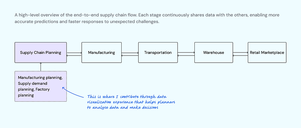
My contribution in the supply chain ecosystem
What was the problem?

Supply chain planners spent more time setting up analysis than interpreting insights and making decisions.
💡 While pivot table and charts were central to planner's workflows, the experience had evolved in a fragmented way.
Old Experience

Goal
User Goal
Reduce time spent configuring pivots and charts so planners can focus on decision-making.
Business Goal
Strengthen the value of Blue Yonder’s Planning solution as a trusted, insight-driven decision platform
Research & Insights
This is a ongoing project with continuous improvements rather than a single, fixed release. Insights were gathered iteratively and informed design decisions over time.
Research methods
-
Ongoing feedback from supply chain planners and admin planners
-
Design reviews and discussions with Product Managers and Engineering
-
Analysis of support requests and usability friction points
-
Observing live user sessions through Pendo.
What did I discover?

-
Frequent reconfiguration of cards indicated gaps in discoverability or defaults.
-
Planners prioritize speed and reliability and accuracy over visual sophistication.
-
Switching between configuration and pivot view broke the analytical flow.
Supply Chain Planner
Current challenges
🧠 High cognitive load - configuring cards and applying settings required high cognitive effort.
✅ Lack of visual cues - planner has to spend time to understand meaning of certain actions.
🔎 Gaps in discoverability - advanced settings are powerful but hard to find.
How is this problem currently being solved?
Demand Forecast Change Observability
Planners rarely start with a fully formed question. Analysis typically begins with a broad data set and becomes more focused as patterns, anomalies, or risks emerge. This meant the experience needed to support progressive sense-making, not just static reporting.
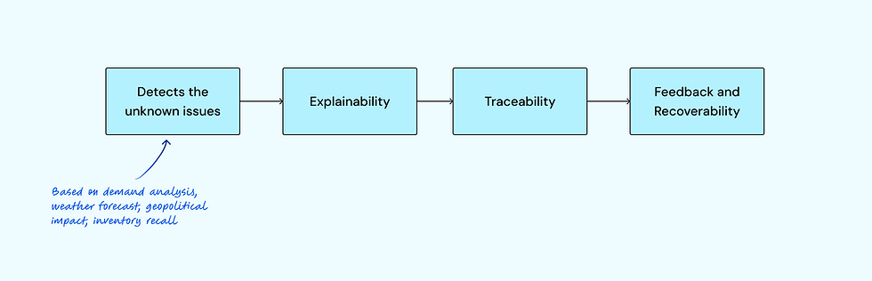
The system detects issues based on the inputs from usual analysis, the weather forecast that might affect transport, geopolitical issues, or inventory recall based on the service called 'control tower.' The planning platform translates these into an actionable summary followed by actions to solve the issues.

Quick summary
Explainability

Deep dive into details
Traceability
Planners often need to analyze a scenario using multiple representations at once — for example, a pivot for granular validation and charts for trend comparison. Previously, these views felt isolated, forcing users to mentally stitch insights together. Each of these cards can be expanded to see more data in a single view without having leave the page.
The functionalities like drill up-down, conditional formatting help planners to see the high level summary and then further break it down to see the details or highlight thresholds, outliers and deviation. This reduces overall cognitive load in dense datasets.

Drill down to find root cause
Data Visualization
A set of features designed to help planners explore data efficiently, surface insights quickly, and reduce manual effort during analysis.
.png)
The system smartly adjusts the initial selection of data and adjusts it to fit into a different chart type on the go along with customizations like line style, color palettes.

Ongoing Product Evolution
Enterprise users value speed, predictability, and control; small interaction improvements can have outsized impact; and fragmented features still require a coherent mental model.
Impact

Accuracy and efficiency
-
Reduced time spent configuring pivots and charts
-
Faster drill-down and comparative analysis
-
Improved confidence in data-driven decisions
-
Better alignment with planner workflows
Let's get in touch
I'm always excited to connect with fellow design enthusiasts, potential collaborators, and those interested in enhancing user experiences.
Social Media
